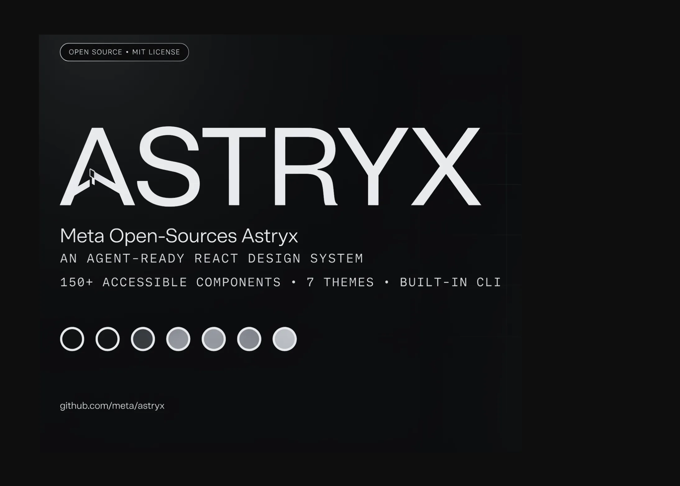
Meta has released Astryx, an open source design system that is fully customizable and built to be operated by both people and the AI agents working alongside them. It is available now in Beta. Astryx is not a new experiment. It grew inside Meta over the last eight years, where the company says it became its most-used and largest design system, shaped by the engineers, designers, and product teams who depend on it daily.
The system ships 150+ accessible components (the docs site now lists 160+), brand-level theming, dark mode, ready-to-ship templates, and a CLI as one cohesive package. It is built on React and StyleX. You import pre-built CSS and use typed React components. There is no build plugin to wire up and no styling library to adopt.
The trade-off Astryx is trying to remove
Most design systems force a choice. Adopt a large company’s system and your app tends to look like someone else’s product. Reach for copy-paste components instead and every project forks its own snippets, with no shared coherence, no upstream fixes, and accessibility quietly becoming your problem.
Astryx separates the two concerns. The system controls behavior, accessibility, and quality. Themes control how it looks. You customize at the token level (color, type, radius, motion) so the app becomes unmistakably yours without rewrites. A theme is simply a set of CSS custom property overrides, so a designer can retheme Astryx without forking or wrapping component source.
Its stated design principles are guidance over enforcement, strong documented conventions, one system for humans and AI, and earned by measurement — conventions are tested, not asserted.
Architecture: foundations, components, patterns
Astryx is organized in three layers. Foundations are the primitives for cohesive, accessible interfaces: typography, color, layout, and accessibility. Components are the 150+ reusable building blocks, all with full TypeScript support. Patterns are battle-tested solutions for common workflows: table pages, detail layouts, form wizards, navigation, and data-entry flows.
Two design decisions make it unusually open. Components are composed at any level rather than locked behind a closed top-level API, and swizzle can eject a component’s full source into your project when you need to own it. Styling is created with StyleX but stays invisible to consumers, so you can override with className using Tailwind, CSS modules, or plain CSS — whatever the project already uses. The explainer below shows how one set of components restyles across Astryx’s seven shipped themes when only the tokens change.
One system, many skins: how Astryx splits behavior from brand
The components below never change. Only the tokens do. Pick a theme, drag the sliders, and watch the same accessible React UI restyle with no rewrites.
1 · Choose a theme
2 · Tune the tokens
Minimalist watch
Clean design, everyday durability.
In stock
Under the hood · three layers
Built for agents, not retrofitted for them
Meta frames Astryx as a response to how software is now written. As more code is produced by agents, the argument goes, design systems have to be rethought rather than patched. The API, conventions, docs, and CLI were designed together, so a person and an AI assistant build the same way from the same reference. Every change that made Astryx easier for AI, the team notes, made it easier for people too.
That shows up in the tooling. The CLI (@astryxdesign/cli) can list and scaffold templates, print full component docs, generate and build themes, run codemods to migrate versions, and surface machine-readable docs from the command line or over MCP. Components ship with consistent naming, prop, and composition rules, so once you learn a few, both people and models can predict how an unfamiliar one behaves.
Requirements and how to deploy it
Because Astryx is a front-end library, ‘deploying’ it means adding it to a React app. The package (@astryxdesign/core, referred to internally as XDS) lists React and react-dom ≥ 19.0.0 as peer dependencies, alongside StyleX. It ships pre-built CSS, so there is no PostCSS or Babel configuration to add. Supported setups include Next.js with Tailwind, Next.js with StyleX, Vite, and a no-build CDN path via the UMD bundle on unpkg or jsDelivr. The interactive checker below generates the exact install and setup steps for your stack and flags anything that needs to change first.
Ship Astryx in your stack: requirements, setup, and a go / no-go verdict
Astryx is a front-end design system, so “deploy” means dropping it into a React app. Answer three questions and get the exact install path, a requirements check, and whether you are clear to ship.
Framework
React version
Package manager
Use case
Setup for your stack